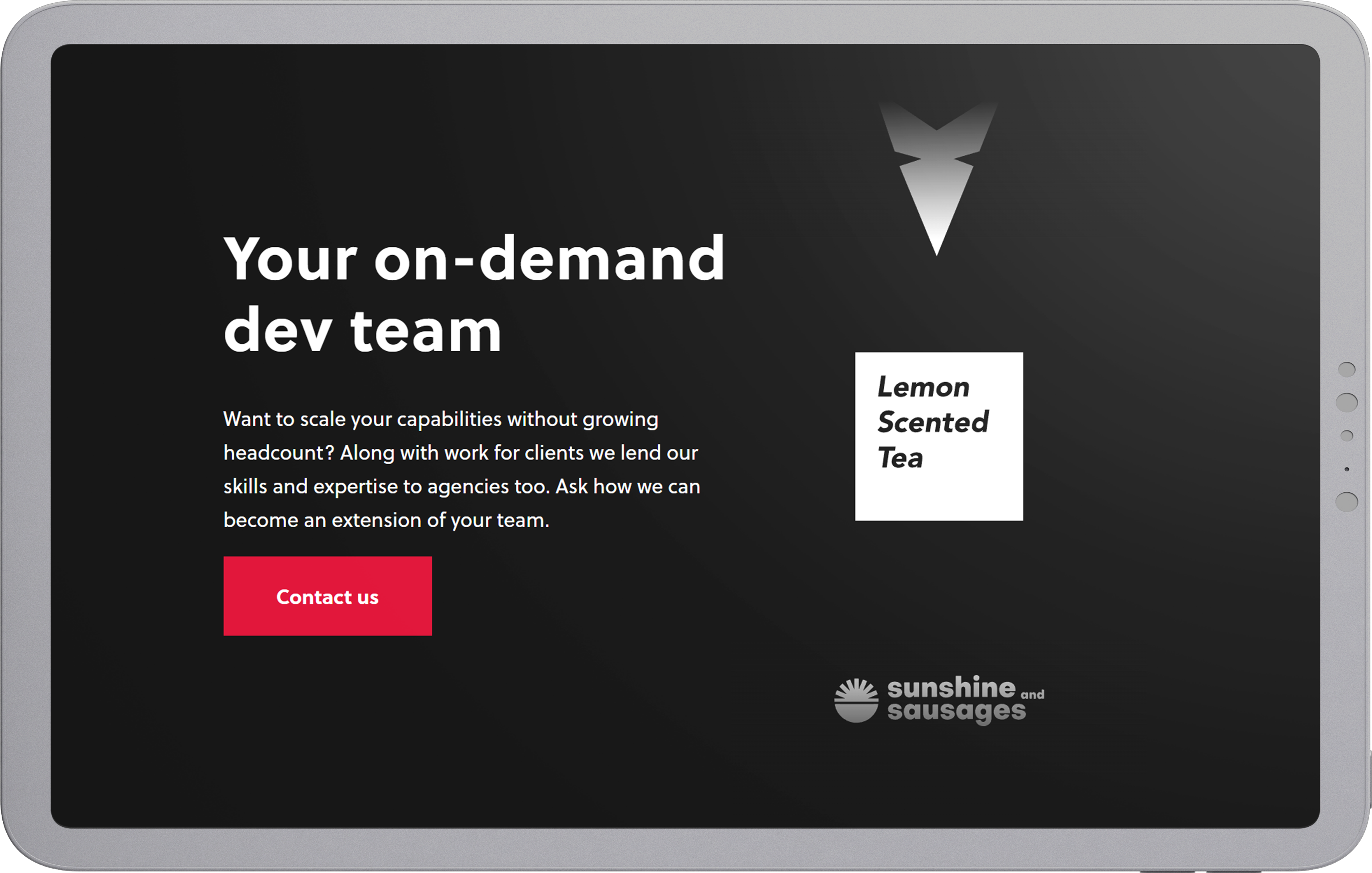
The Pack is a digital agency specializing in unique and immersive online experiences. It’s co-owned by a digital product designer, developer, and a digital marketer. They thrive on digital innovation in the browser, great user experiences, and geek culture.
Client Brief
The Pack needed a new website that reflected its current business strategy and identity. The website required better storytelling, brand expression, and improved usability. Their new business strategy included partnering up with other digital agencies and attracting future employees. So aside from small and medium-sized enterprises (b2c), The Pack was looking forward to broadening its horizon on the market.
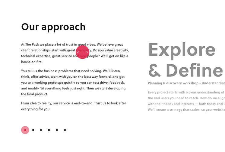
Approach
Co-Creation Sessions
To establish a new brand identity and requirements for the new website co-creation sessions were held during the starting and design phase of this project. Together with the owners of The Pack different design idea’s were pitched and discussed. In the end we landed on a sleek agency website that show’s The Pack’s passion for custom experiences and geek culture.
The following requirements were established:
An enthusiastic tone of voice
A clean but powerful visual identity
An engaging and concise user-flow
Conversion goals for the target audiences (b2b, b2c & future employees)
It was my responsibility to ensure that these requirements were incorporated into the website and corporate identity.
Facilitate Exploration
Micro Interactions
As an aid to designing a concise user-flow, different information needs are supported in the design. Important content is viewable on the service while additional information is accessible via micro-interactions throughout the website. This allows for a quick deep dive without cognitively overloading users who want to reach their goals as quickly as possible. Micro-interactions proved to be the solution, throughout the website they are used to enhance the user experience.
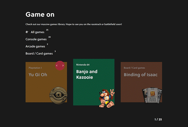
Hyping up fellow geeks
The Pack has a passion for gaming and this is apparent when visiting their office. It’s loaded with console, board, and arcade games. For future employees, the Pack wanted to attract fellow geeks that share the same passion. Thus a game section was created for the job pages. Users can take a deep dive and discover all the games they can play at the office.
[The Games Libary]
More than just a pointer
Not only are the micro-interactions used to facilitate exploration by revealing additional content, but they are also used to aid in the usability of the website. Different shapes and behaviors are assigned to the interactive mouse pointer to make user actions clear.
[Approach]
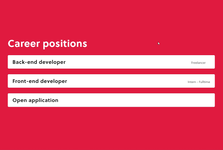
[Career positions]
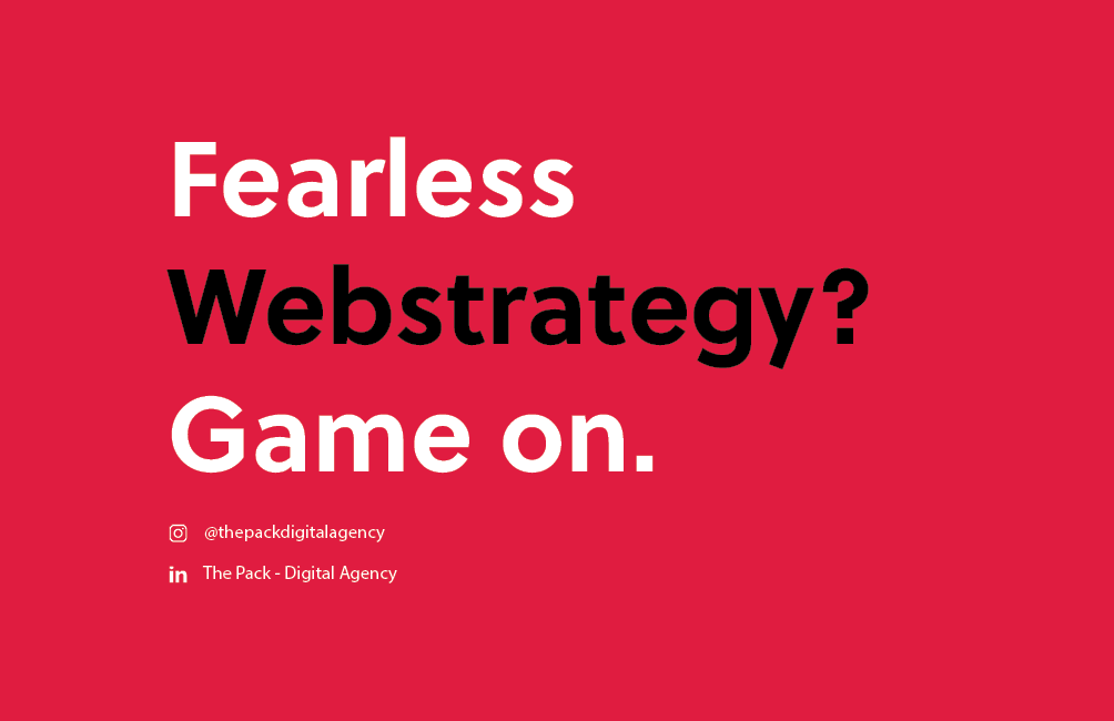
Rebranding
Colors & Typography
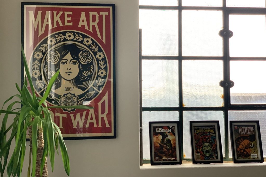
The branding for The Pack is inspired by the no-nonsense attitude The Pack has for creating digital solutions. The colors red and black are powerful and inspired by the art hanging in their office.
[One of many Artworks at the office]
#FFFF0
Primary Color
#1C2541
Primary Color
#FFFFFF
Secondary Color
#EFEFEF
Secondary Color
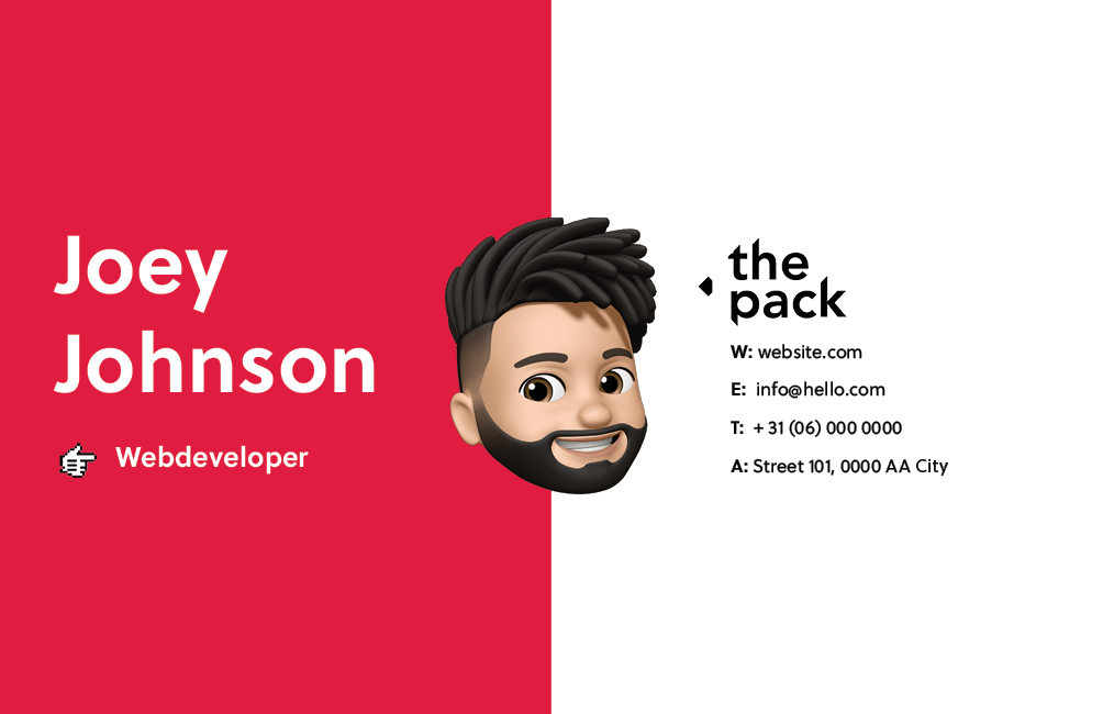
Physical Artifacts
Aside from the website, the Agency also needed their current physical artifacts in a new style. Company brochures documents and business cards all got the treatment in the new brand identity.